Back

Transition:
-
Purpose:
- Smooth State Changes: Transitions are primarily used to smoothly transition the state of an element from one style to another when triggered by a change in property values.
-
Properties Affected:
- Specific Properties: Transitions are usually applied to specific properties (e.g., opacity, width, height).
-
Trigger:
- Event-Based: Transitions are triggered by changes in property values, often in response to events like :hover, :focus, or changes in class.
-
Key Components:
- Transition Property: Specifies which property or properties to transition.
- Transition Duration: Specifies how long the transition should take.
- Timing Function: Defines the pace of the transition (e.g., ease, linear).
- Delay (Optional): Specifies a delay before the transition starts.
Syntax
            .box {
              width: 100px;
              height: 100px;
              background-color: blue;
              transition: width 1s ease-in-out .2s;
            }

            .box:hover {
              width: 200px;
            }
Transition hover on card
Card title
Some quick example text to build on the card title and make up the bulk of the card's content.
Go somewhere
Card title
Some quick example text to build on the card title and make up the bulk of the card's content.
Go somewhere
Card title
Some quick example text to build on the card title and make up the bulk of the card's content.
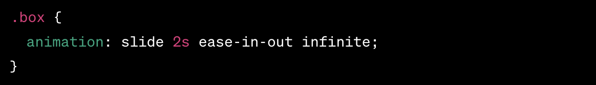
Go somewhereAnimation:
CSS3 introduces a powerful feature called CSS animations, which allow you to create smooth and visually appealing transitions or animations on HTML elements. CSS animations provide a way to change an element's style over a specific duration, giving web developers the ability to create dynamic effects without relying on JavaScript or Flash.
@keyframes Rule: